Mixing and Matching Patterns: A Beginner's Guide
- Cynthia Haller
- Apr 22, 2025
- 6 min read

Remember all those advices you got about not overdoing it with colors and patterns? Be it in your home, or your clothes, we've gone into the realm of boring beige, neutrals and solid colors for a few decades now. If you are old enough, you might remember the late 90s when grandmillennial florals were for wealthy people and considered old school, only to be completely phased out once we reached the 2010s and the depressing era of black, white and grey home decor that people deluded themselves into thinking it was prefection simply because that's how real estate agents showcased houses put on the market. Sure! Neutral sells, and attracts a broader market, but it's a real bore to live your days into.
Sadly, people became afraid of mixing colors, or patterns for that matter. Stripes and flowers? Are you mad? Paisley and checkered plaid? Really?
I'm here to tell you that this fear or color and pattern mixing is irrational at best, and all you need to get over it and infuse joy into your home is a comprehensive beginner's guide to mixing and matching patterns (and colors). So are you ready to dive in and kick the sad beige mom aesthetic out the door? Let's dive in!
Start with a plan, and a color palette

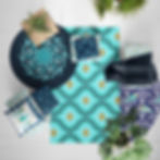
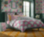
Refinement in home decor starts with picking a color theme for your room and make sure it's the right balance between minimalist monochromes and "help I think a paint factory exploded in there" My advice is to pick one main color for the room, include 2-3 shades of it and pick one complimentary color again in 2-3 variations and either a neutral or a contrasting color to use for accents. For example, in the first picture of this blog post where I feature The Maharani's summer garden collection. The main color is green, with a pastel mint green as the dominant color, a matching forest green and a mid-tone green. The complimentary color for green is red and since I'm predominately using a pastel green in that scheme, the natural complimentary tone is pink, I used a light pink and a dark pink. I added a sunny yellow and a few pops of white as my contrasting accent color. In the picture on the right I featured my Pacific Beach collection, I used a dark blue and turquoise as my main color, and instead of adding orange as a complimentary, I went with gold / yellow and used white as my accent color in an effort to keep it coastal.
If you aren't sure about picking a color palette, I suggest you pick inspiration from Pinterest, if you search color palettes, you'll be shown a lot of aesthetic palettes of 5-6 colors each to get you started.

Once you have your palette, start by deciding which color is going to be your primary color. To go back to my Maharani's summer garden bedroom, the primary is mint green, supported by darker green elements. These two colors are the hero colors. In that mockup you can see that the floral wallpaper is mint green, so is most of the bedding and the wood panelling is a solid forest green that is echoed in the fabric of the bed frame and the lampshades.
The pink flowers and arches are here to brake the monotony of the green and add a bold contrast. The yellow is acting a tertiary color in this decor scheme and it's role is to provide a place for the eyes to ground themselves without the color dominating the space and competing with the primary and secondary colors. With accent colors, less is more in a maximalist decor scheme.
But what about mixing and matching patterns? What's the rule?

The key to mixing patterns is to find a good balance, and like with the color scheme work with one or two "hero patterns" and 2-3 filler patterns.
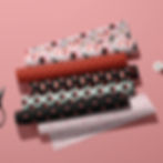
Take my Sushi Party collection featured on the right. It features one big hero pattern which is the pink roll of fabric on top, and two sort of hero patterns in the sushi roll and nigir sushi patterns, along with 3 filler patterns : the white stars on a red background, the red and white sparks on a black background and the pink chopsticks pattern.
Note that your hero pattern DOES NOT have to be the dominant pattern in your decor unless you are going for a really bold decor. For example, the pink hero pattern could be super overwhelming if used as a wallpaper (though not lying it would look cool). So if you were planning to decorate the kitchen or your dinning room with this pattern collection it probably would be a good idea to use either the red or black filler pattern as a wallpaper, and use the hero pattern for curtains, or chair cushions, and add accents like placemats in any of the other supporting patterns in the collection.

Similarly, If you were to wallpaper your walls with a bold rustic pinecones wallpaper like this one from Spoonflower, you better go easy with other rustic patterns like a plaid, and keep your upholstery furniture in a warm neutral like they did in that mockup picture with the sofa. Remember this simple rule : If you are using a filler pattern as your dominant pattern, use a bolder hero pattern as an accent, and if you use a bold, large scale hero as your focal point, use a smaller matching filler pattern (or two) as your accent patterns. In home decor, you want to make sure that nothing steals the show away from your focal point, or main theme. The more patterns you mix and match, the more important that rule of thumbs become.
If you are a complete beginner at it, rely on premade collections like the one I specially curated on Spoonflower and this website. I took the hassle of figuring out what goes well with what for you...to and extent.
Always order swatches first

Home decorating can get really expensive so take your time to make an informed decision about your fabric, wallpaper and paint. Do not go just by the image on the screen if you buy your fabric and wallpaper online, and if you go to a home decorator, do not make do with the stamp sized sample in their fabric collection book.
Before becoming a surface pattern designer, I used to be an interior decorator specialised in upholstery. We ALWAYS encouraged our clients to place an order for a fabric sample swatch. They are usually about 8 x 8 inches big and will give you a MUCH better idea of how the fabric will look. We also encouraged our client to place it in the room they planned their sofa or armchair, or curtains to be and leave it there for a few days to get an idea of how it would look in different lights. Something that looks good on a sunny morning might look ugly on a rainy day or completely off in artificial lighting at night. You don't want to commit to buying yards and yards of fabric or 20 rolls of wallpaper only to realise much later that they look completely wrong in your room. Ditto with paint, do not go by that 1 inch big paper square to buy 2-3 bucket of the stuff. Paint companies sell sample size pots for a reason. Buy the colors you are hesitating between and paint generous swatches on your wall at home to decide what works and what doesn't.
Still scared to go all out with patterns and colors?

It's ok to start small, especially if you live in rental where you'll be limited as to what you can do home decor wise. Start by mixing and matching patterns on your throw pillows. You can buy as many as you want in your favourite colors and experiment with pairing them. You can mix things up by changing your bedding and get a new comforter or curtains. Then add a few artworks on your wall that match your color scheme and theme. Or go completely eclectic building a framed art gallery wall.
There are absolutely no reason to shy away from colors and patterns in your home. You aren't living in a Pinterest worthy real estate show home. Bring some personality into your home sanctuary.
