
How to build a cohesive collection of patterns...effortlessly
- Cynthia Haller
- Mar 30
- 5 min read

You've probably heard it a lot in the surface pattern design industry : collections are important. Be it on print on demand or when you plan on licensing your work, you have a better chance at appealing to a buyer if you have a collection of coordinated patterns they can chose from.
That's where things can start feeling very daunting and if you are sitting in the corner scared to try, I hear you! I've been there and I stuck to making random patterns for YEARS without putting thought into mixing and matching them.
Ironically, long before I moved to India and built my life here I was once an apprentice interior decorator who specialised in upholstery. So I KNEW about collection all along, I saw the sales rep for all the various home decor fabric brands on the market waltz into our workshop twice a year with their new sample books. My boss included me in the process of choosing which collections we would carry in the store. What I didn't know back then was that surface pattern design was a career, and one that I would have picked over being an uphoslterer - decorator should I have known it was a possibility in my late teens. I found fabric fascinating and I absolutely LOVED when the sales rep came in. It was far more exciting than upholstering yet another antique chair in something 90s / Grandmillennial beige/gray.
Then I started going into surface design, because I believe what we love does chase us, and I took my own sweet time getting to the crucial point of building collection. So if you are confused about where to start, consider this to be your guide on how to build cohesive collections of patterns...effortlessly.
Are you ready to dive in? Here goes!

Start with what you already have
If you have been creating patterns for years, chances are you already have a LOT that can go well together without even knowing it. Why? Because there are always going to be color palettes that you tend to use more often than others, and geometric designs you tend to favor. One of my earliest collection is "Tiger Safari" (picture on the right). I built it after I noticed a massive surge in sales of my pink and orange tiger design on Society6. I quickly sifted through my seamless tiles library to find I had a lot of other designs in that same pink and orange color palette, and just like that, with minimal effort, I got a collection of 4 patterns and a stand alone art print tiger thrown in the mix.

Use product mockups to visualize your collection coming together.
If you are anything like me there is a fat chance you need to see how those patterns work on real objects rather than try relating to two dimensional swatches. This is where product mockups come in. Not only are they a great way to make your portfolio look professional. They also are a fantastic way of seeing how your patterns work with each other, especially when you are starting a collection with older patterns.
And yes! I know these mockups can be expensive, especially when you are starting up, but you can get a lot of great ones for free. Creatsy is my favourite mockup creator and they offer a LOT of freebies. What's more, they are active on Instagram and organize fun contests where you can win store credits to get you started. I tend to play with different products, not just fabric, even though my patterns are all mostly created with fabric and wallpaper in mind because I will always be a decorator deep down. But if you know the only thing you ever want to be into is fabric, just get some of their fabric bundle mockup so you can visualize a fabric collection rather than trying to reconsiliate your mind around the idea of coffee mugs or party gear.

Start with a hero pattern
Feeling more confident? It's time to start a whole collection from scratch. It's not that hard really, and I say that as your resident overthinker with ADHD running the show! Remind yourself to start simple : pick a theme, then draw the elements for the hero pattern. That's it! That's where you start when you build a collection. Those adorable sushi oven mitts on the right? I started with an art print illustration with different sushis and chopstick on a pink background and made a matching pattern. Then used some of the sushi elements on their own to make companion patterns. Last I added two simple filler geometric patterns in the same colors. This is how the final collection looks like :
Just like that, I got 6 patterns that can mix and match effortlessly.
Keep your color palette simple
The key to a cohesive collection is not to have too many colors competing for attention. I usually stick to no more than 6 main colors and shades of them for texture. More colors mean it's going to be harder to coordinate patterns, not impossible, just harder.
Not all collections have to be huge
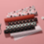
Thinking a collection need 6+ patterns to feel like a collection? Think again! Not everything has to be big to make an impact. You can have mini collections with just 2-3 patterns and still have a solid collection. Case in point, the Dolce Vita collection :

It has only 3 patterns, the hero one being the yellow lemons and blue leaves with a supporting yellow gingham and blue stripes as filler patterns. In home decor people usually stick to 2-3 coordinating designs anyway, so don't feel you'll be missing out if you haven't made a collection with 3 hero patterns and 6-7 fillers.
Keep it simple
Don't feel you have to be original and reinvent the wheel when you create filler patterns, there is nothing wrong with doing basic stripes and a gingham, or polka dots. These are unlikely to be the kind of patterns someone will find you in searches on Spoonflower. BUT! It could be what makes them decide to buy the lemon one simply because they were looking at fabrics for a project that requires matching companion prints.
Work with trends
Last but not least, look at current trends when you are stuck and looking for an idea. Spoonflower's design challenges are a great way to get inspiration for a collection. So are paying attention to Pinterest's annual trend reports. If you already have sales on your designs, pay attention to what is selling already. We all know Pantone really lost the plot with Cloud Dancer, fortunately they aren't the only color authority out there and Coloro in partnership with WGSN (a trend forecasting company) has made far more accurate predictions when it comes to colors. Right now they are predicting a gorgeous rust orange tone called Radiant Earth as the 2028 color.
I hope this little guide has made the idea of arranging your patterns into collection a little less daunting. let me know if there are topics you'd like me to touch in future blog posts.